Evercam Capture
An app for construction sites to capture detailed walkthroughs using an external camera

An app for construction sites to capture detailed walkthroughs using an external camera

Evercam.io provides construction camera software that helps with time-lapse video creation, live monitoring, and project documentation. It uses advanced camera technology and AI-driven analytics to let project managers, contractors, and stakeholders monitor sites remotely in real-time.
Construction site walkthroughs play a critical role in project documentation, quality control, and team collaboration. However, traditional methods of documenting progress, which rely solely on photography, often miss key details (create blind spots) and create communication gaps among stakeholders. To address these challenges, Evercam assigned me the task of designing a user-friendly mobile app that facilitates new technology of 3D recording of walkthroughs.
In discovery, learning about the technology and the user were equally challenging.
On-site workers often use helmet-mounted cameras to conduct virtual walkthroughs. The illustration outlines the steps involved, from connecting to the camera to uploading footage. However, it doesn't capture the human challenges of ensuring regular and thorough inspections.
By interviewing on-site and off-site stakeholders, I developed a range of personas involved in the walkthrough process. While inexperienced laborers often conduct the walkthroughs, other personas with distinct motivations play a role. Notably, the laborers themselves may not directly benefit from the process, posing a potential design challenge.
Given the complexity of the app, I did early flowcharting to work out the users path through the app.
I visited Evercam's test site to personally experience a walkthrough. The video taken from the Evercam website showcases the correct procedure for performing a walkthrough. Please note that the app featured in the video is an early prototype, developed before the redesign.
Through interviews and secondary research, I identified key insights that guided my design decisions.
Construction sites are inherently distracting environments, which can easily divide a laborer's attention. Therefore, it's crucial to communicate the current "state" of the walkthrough process clearly and effectively.
During a walkthrough, users need to be aware of various states, including:
By providing clear and timely updates on these states, design can help users stay focused and ensure a successful walkthrough.
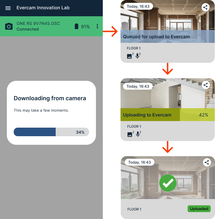
While downloading a 500MB file from the camera might be relatively fast, the subsequent upload to Evercam can take significantly longer, especially when not connected to Wi-Fi. To mitigate this issue, we must ensure that the upload process continues seamlessly in the background and can be easily resumed if interrupted.
Given that the primary user of the app is often a junior laborer who may not directly benefit from its use, it's essential to address potential motivational challenges. To encourage regular and thorough walkthroughs, the design should incorporate features such as reminders, guided experiences, gamification elements, and positive reinforcement.
Additionally, project managers should receive timely reminders and updates to facilitate check-ins with users and ensure the app is being used effectively. By implementing these strategies, design can enhance user engagement and promote consistent use of the app.
We took our understandings and built a solution that mapped to the real world
Try a clickable Figma prototype
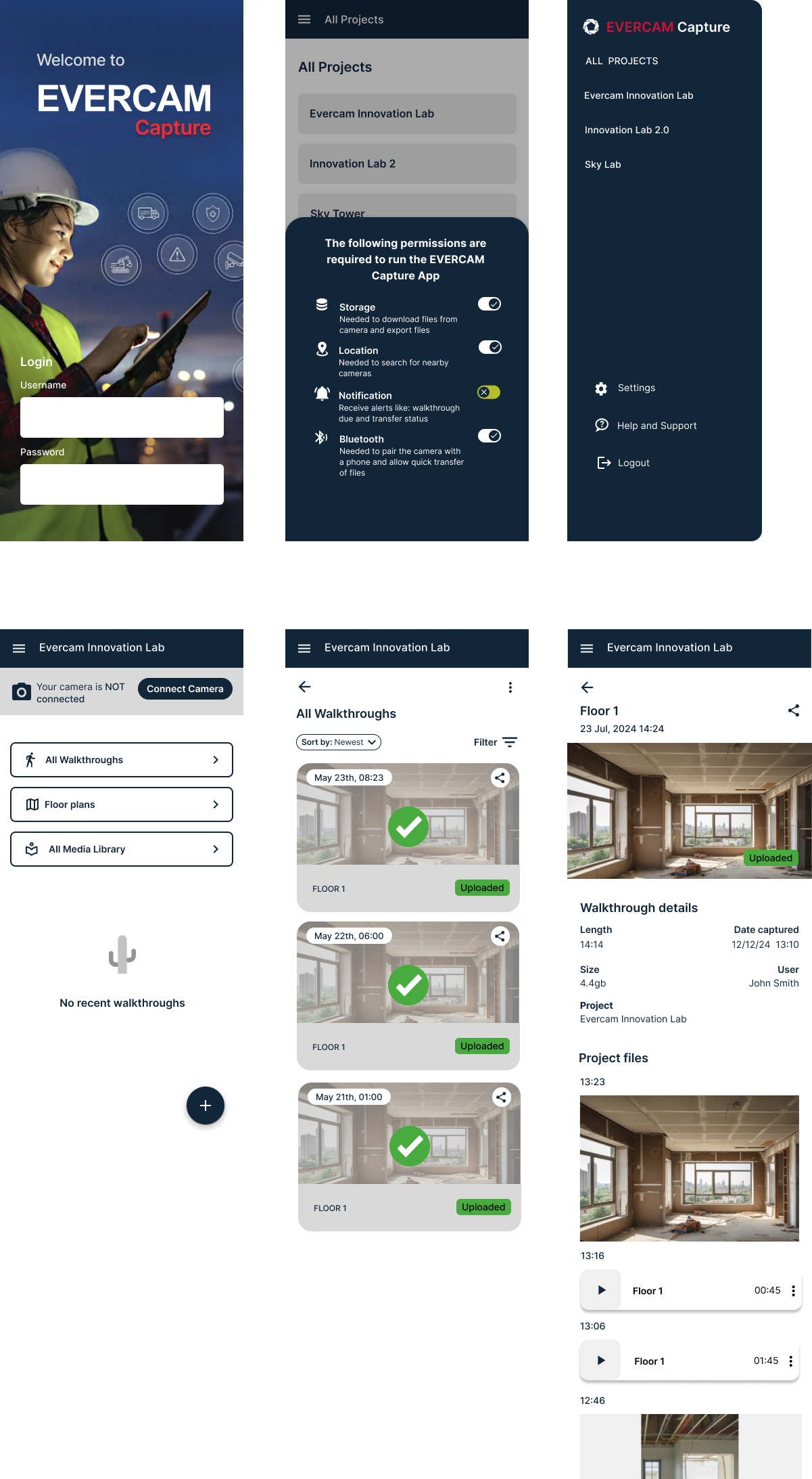
To navigate between projects, the user can access a global navigation menu via a hamburger icon. While users may occasionally switch projects, many will spend extended periods, often months, working within a single project. To accommodate this, I've designed the default login experience to take users directly to their most recent project page.
Within a project, the design offers in-page navigation to the primary categories of "things" contained within the project. These categories include walkthroughs, which serve as the primary documents, as well as cross-cutting sections such as all media and floor plans.
A key innovation in the design was the creation of a dedicated page for each walkthrough. This dedicated page provides a focused and streamlined experience for users to view and interact with walkthrough content.
To visualize the complete page flow, please refer back to the flowchart in the discovery section.

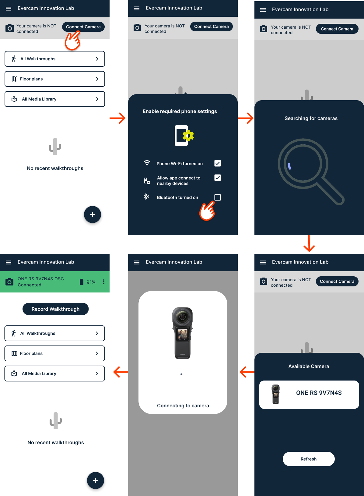
When I joined the project, the engineering team had already set up a basic way to connect the camera. I built on their work by adding these features:

The recording flow is undoubtedly the most critical aspect of the application. To simplify the process for users, I implemented a stepper. The stepper interface allows for easy navigation and provides a convenient way to move backward if necessary.
To ensure a smooth recording experience, I've incorporated on-screen instructions to guide users through each step. Understanding that users may require some level of retraining with each walkthrough, the design made these instructions readily accessible.
During the recording process, a walking animation is included to visually reinforce the desired behavior. Additionally, a discreet mini-camera view is provided to reassure users that the camera is functioning correctly without distracting them from the task at hand.

The transfer process involves a relatively quick download from the camera followed by a potentially lengthy upload to Evercam. To keep users informed throughout this process, I designed a visually engaging tile that dynamically updates its appearance to reflect the current transfer status. This real-time feedback helps users stay engaged and aware of the progress.

The media management section draws inspiration from the familiar conventions of photo apps commonly found on smartphones. To enhance functionality and user experience, I introduced several additional features:

Users have the flexibility to share walkthroughs with both internal and external collaborators. Drawing inspiration from Google Drive's sharing interface, I strategically positioned the share button in the top right corner of the screen. This placement, similar to the send button in the Gmail app, ensures that the button is always visible and easily accessible, even when the bottom drawer is open.
