Easy book
Easily find the best hotels at the best prices in Europe
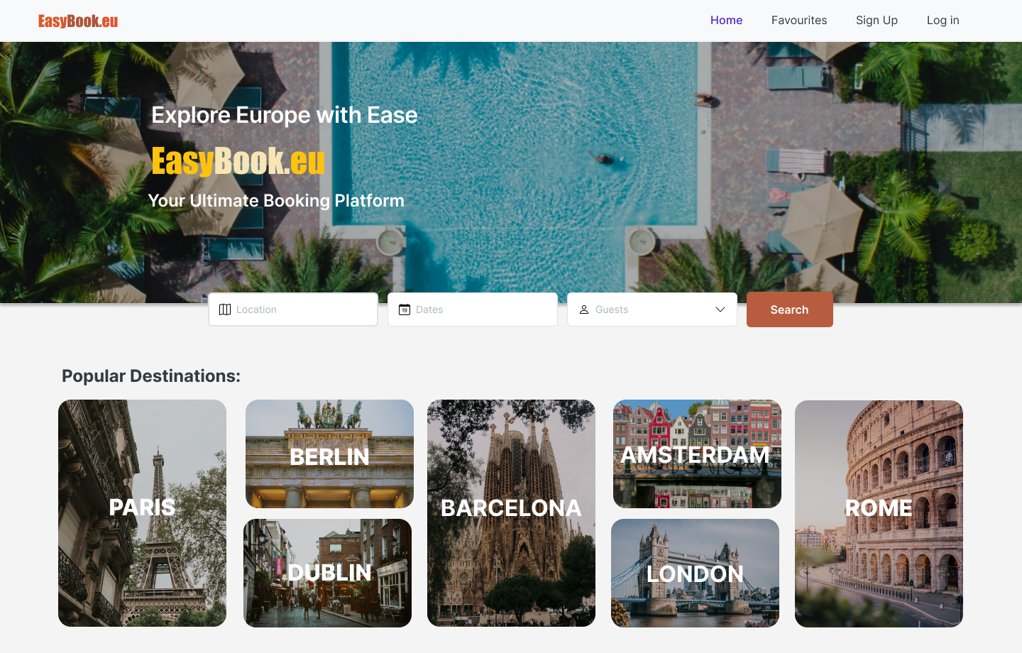
Easily find the best hotels at the best prices in Europe

Easybook is a hotel booking aggregator that operates within Europe. The platform aims to provide the highest quality content and the smoothest user experience compared to other players in the market. As a result, ensuring a seamless purchasing process is of utmost importance to their business.
The discovery phase was enjoyable because I love travelling. This stage involved competitive analysis, testing with real users, and interviews, resulting in a journey map and prototype iterations.
I analyzed several competitors to gain insights into their UX. This involved recruiting some friends to conduct user testing on the competitors.
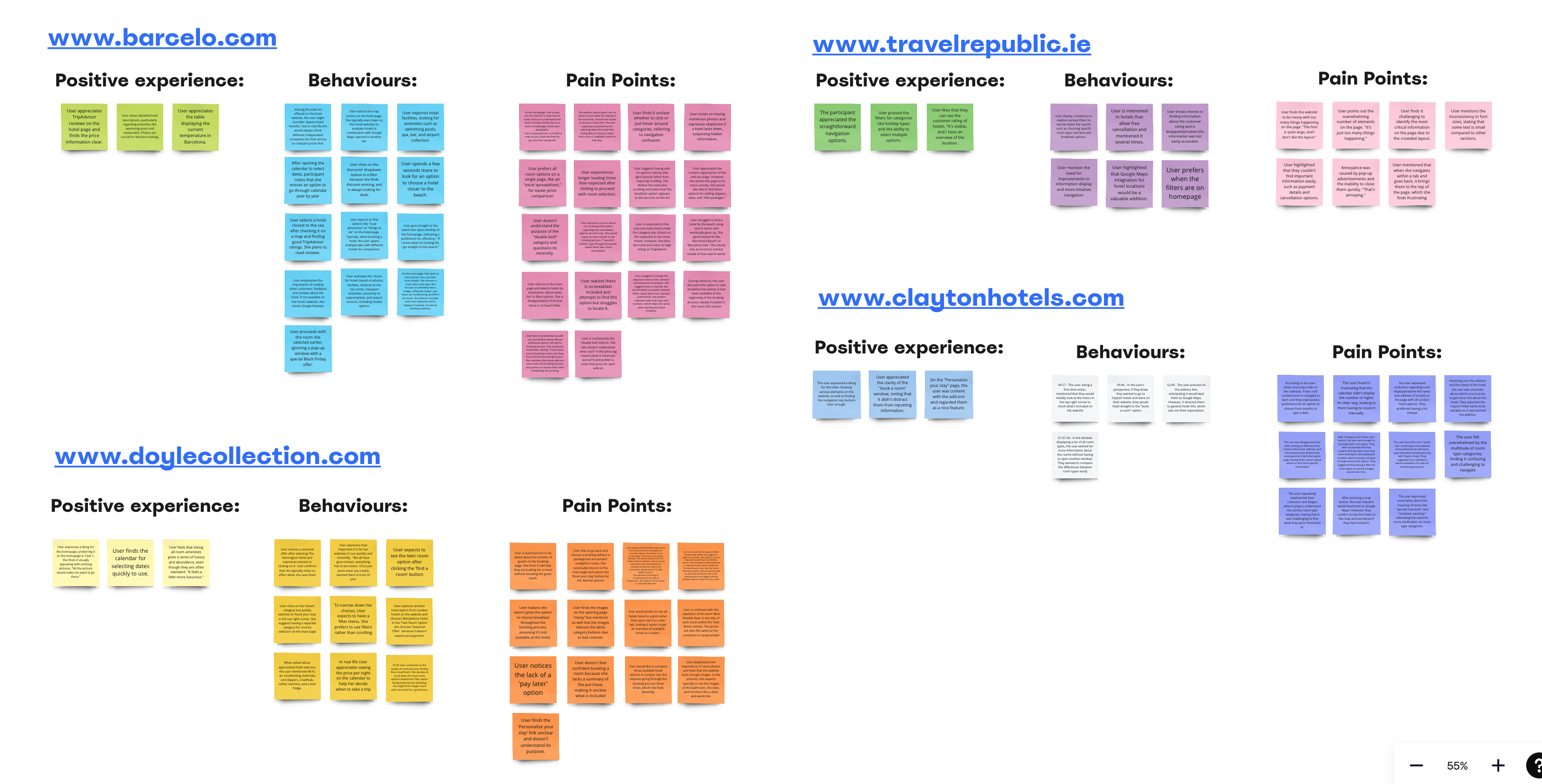
Using the results of the competitor's user testing, I developed a Journey Map to identify areas where the user experienced difficulties. The activities of searching & filtering and room evaluation stood out.

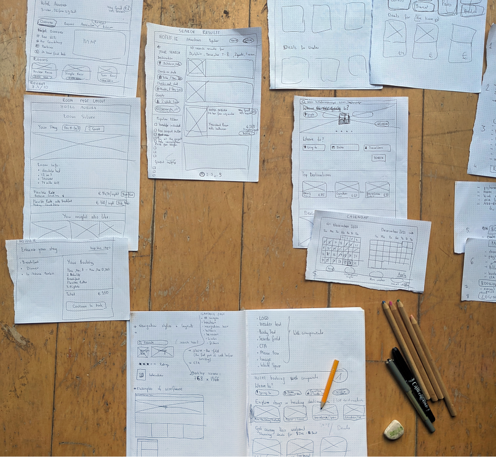
I emphasise paper prototyping early on as it forces me to be more considerate. This is the first time I have tried to create a flow that solves all identified problems.
The discovery process has allowed me to develop key insights, which have become the foundation for what I’m hoping is a good, user-friendly booking experience that addresses all the identified problems.
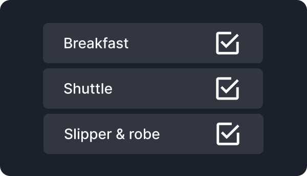
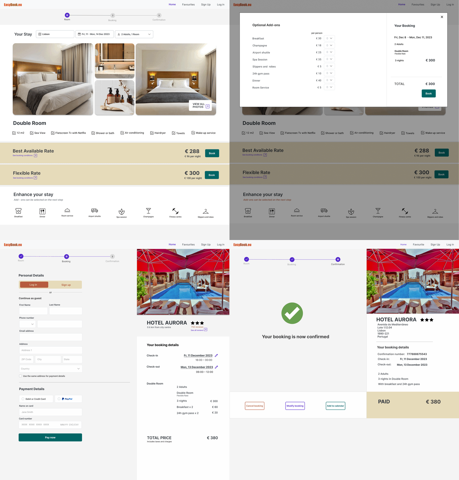
Users dislike being bombarded with additional offers or upgrades while booking a room. It is important to provide a clean and focused booking experience without trying to upsell too many extras too early in the booking process.
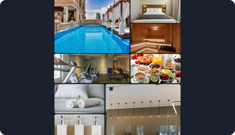
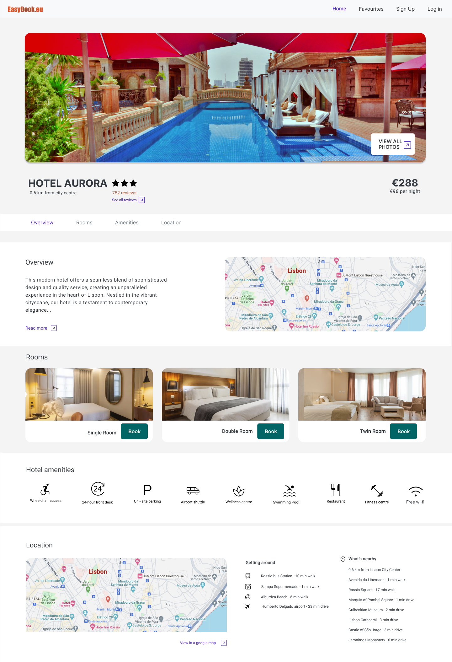
When it comes to making booking decisions, having a large selection of high-quality images showcasing the hotel, its amenities, and the surrounding areas is essential for helping users make informed and confident choices.

Knowing exactly the location is a significant factor for users. Providing detailed maps that help users to geographically contextualize a hotel's location and understand its surroundings adds value to the booking experience.

Research confirmed that users found reviews and ratings an important factor in making a hotel choice.
The solution combines all key ideas to give medical users a complete experience for shopping, journaling, and learning about cannabis, supporting them at every step.
The medium is the message, and booking websites have standardized the use of the page header to input basic details. Therefore, a booking platform functions similarly to a search engine.
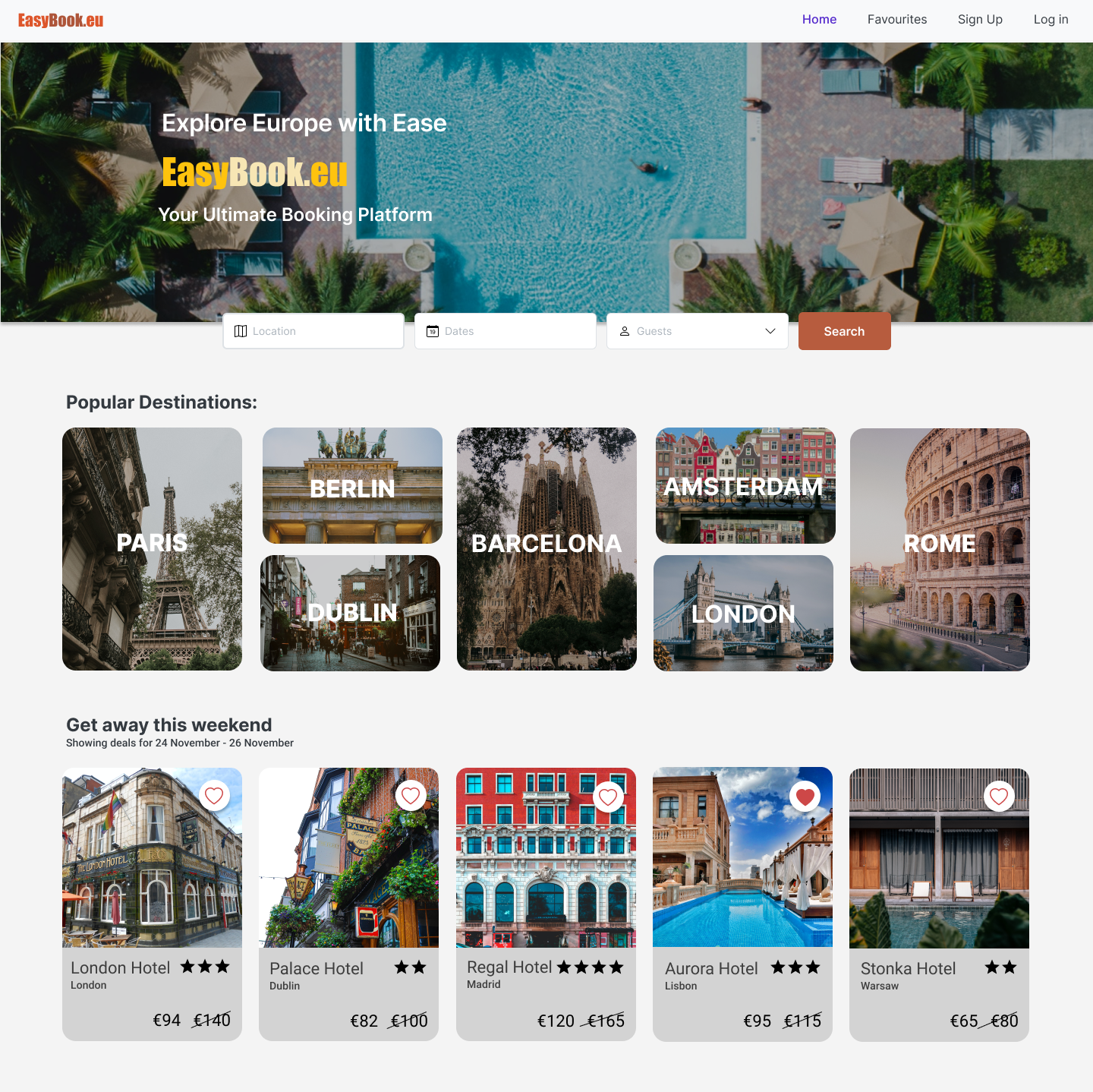
Users need the flexibility to change their preferences on the fly, so it's essential to keep fundamental filters, like location and date, readily accessible. However, there's a balance to strike with progressive disclosure, breaking filtering into manageable stages. In the second stage, users can further refine their filters.
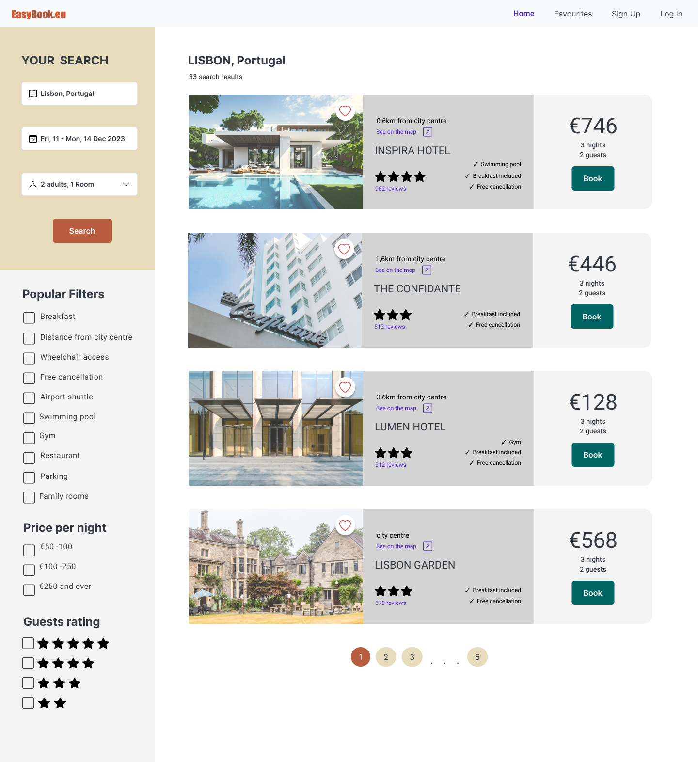
Interviews revealed that users are especially concerned with the distance from the city centre, availability of breakfast, and cancellation policies. These priorities are emphasized in the design to meet users' needs effectively
The hotel page is where decisions are made. Key social proof elements, such as reviews and photography, are prominently featured. The rest of the page is organized to answer all user questions as clearly as possible. Information is divided into sections like hotel amenities, transportation options, and nearby attractions. Distinct visual treatments for each section make the page easier to scan. Additionally, I use progressive disclosure to hide details within sections, such as customer reviews, photos, and overviews, until the user chooses to view them.
Once a user selects a room, a booking wizard is initiated. Since the user has already put in significant effort to reach this point, it’s crucial to make the remaining steps feel straightforward and achievable. Booking wizards are great at breaking lengthy processes into manageable chunks. We adhere to usability heuristics by displaying system status (booking details), providing control and freedom (allowing changes to dates, etc.), and preventing errors through well-designed forms. This method guarantees an easy and user-friendly booking experience.
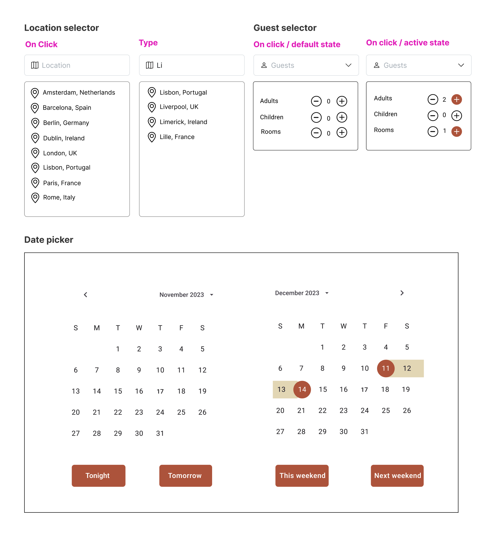
I needed to create custom UI patterns that did not exist in the UI kit. These patterns are common in booking software. For example a date selector spanning two months.
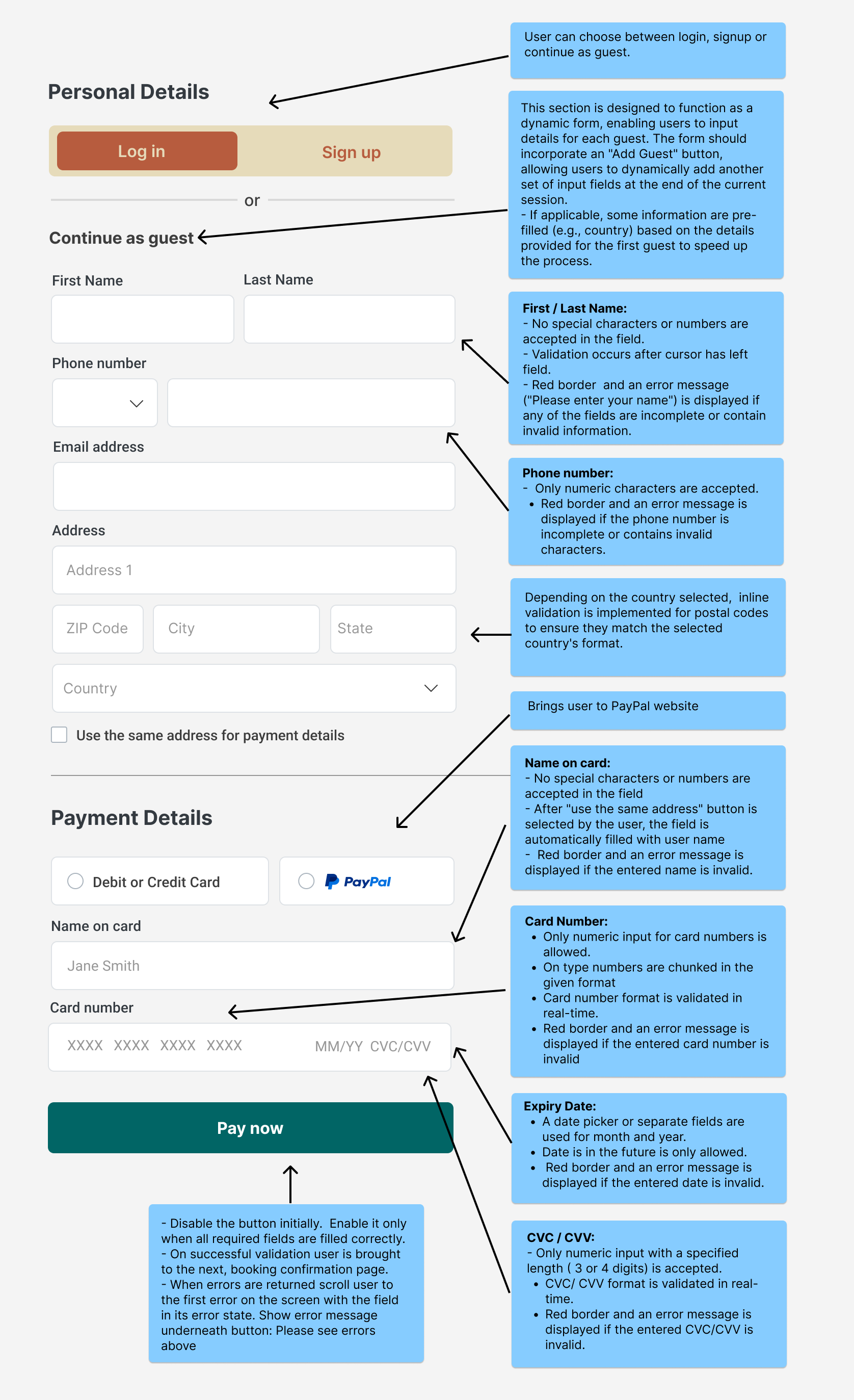
Considerable UX effort goes into making effective forms. In the case of Easybook the checkout form needs to validate for:
